The stock market this year has seen some impressive growth following the 2020 Coronavirus market crash, and many stocks have more than recovered. However, it’s not just equity prices that are finding peaks, but trading volumes too. Retail investing has been skyrocketing, and a top contributor is Robinhood.
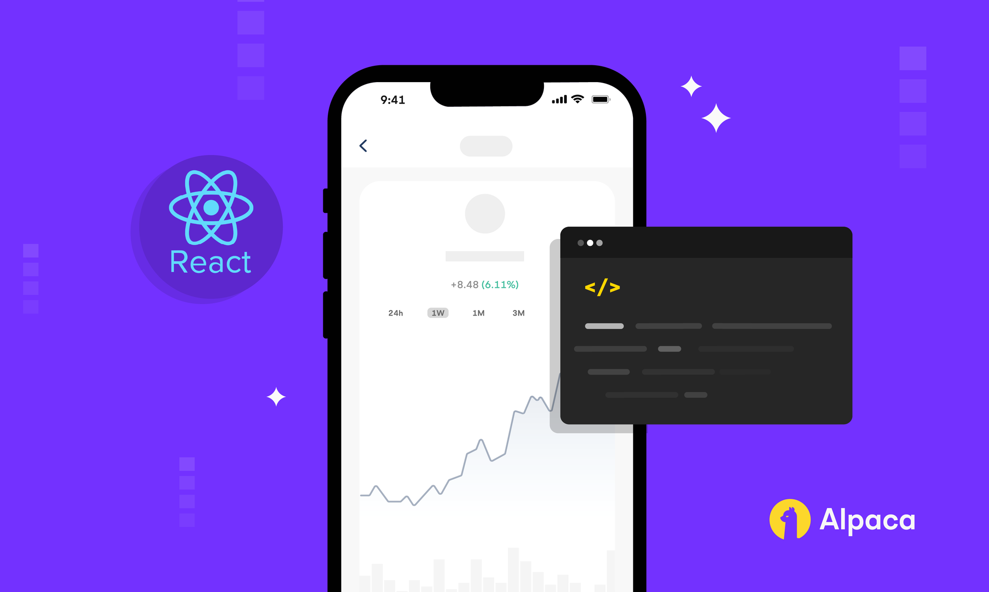
This year, Robinhood priced its IPO at $38 per share valuing the company at roughly $32 billion. It is one of the most popular trading apps, and has reached 18.9 million monthly active users in the third quarter of 2021[1]. In building your own app, you may be asking yourself, why is Robinhood so popular? Well, they do many things right, specifically targeting amateur investors, and making commission-free trades highly accessible. However, this isn't what sets them apart.
One of the key features of Robinhood’s interface is its simple and interactive line plot. “Good design can materially help make a good product reach its full potential” the second president of IBM, Thomas J. Watson famously told the world[2]. Putting these things together, we can see that creating a line plot that will engage the user is crucial in having a successful mobile trading app, and in the following sections, we’ll see how you can implement one for yourself using SwiftUI and RHLinePlot. If you’d like to skip the explanation and find out how to implement the plot immediately, there are instructions in a section at the end of the article.
How will the plot get historical data?
Getting started
To get stock data we will use Alpaca API, and in particular, Market Data API. Alpaca Market Data API v2 provides market data through an easy-to-use HTTP API for historical data and through websocket for real-time data. There are many useful endpoints exposed here, but in particular, we want bar data from GET /v2/stocks/{symbol}/bars. In order to use Alpaca API, you’ll need access to your API keys, and to find those you can follow this guide.
Making GET requests in Swift
The Bars endpoint requires that you know the stock symbol you’re looking for, the start and end of the time period in question, the timeframe granularity, and that you pass these values in as parameters. The documentation for exactly how can be found here. In this article, the requests will be made for SPDR S&P 500 (NYSEARCA: SPY) and use the daily timescale. In this case, we can formulate the URL using the following snippet:
private static let baseURL = URL(string: "https://data.alpaca.markets")!
let symbol: String

var start: String {
        let dailyOffset = -5 // 5 month period
        return (Calendar.current.date(byAdding: .month, value: dailyOffset, to: Date())?.iso8601)!
}

var end: String {
      let dataDelay = -16 // Alpaca free plan delays data by 15 minutes
      return (Calendar.current.date(byAdding: .minute, value: dataDelay, to: Date())?.iso8601)!
}

var urlWithBars: String {
      String("\(AlpacaAPI.baseURL)/v2/stocks/\(symbol)/bars")
}

private var query: String {
      String("?start=\(start)&end=\(end)&timeframe=\(timeSeriesType.timeframe)")
}

var fullURL: URL {
      URL(string: "\(urlWithBars)\(query)")!
And this yields a URL that looks something like:
https://data.alpaca.markets/v2/stocks/SPY/bars?start=2021-07-07T20:09:05Z&end=2021-12-07T20:53:05Z&timeframe=1Day
Now we’re ready to make an instance of URLRequest using the URL we’ve made. Here we make sure to specify the type of request (GET) and our API keys.
let url = self.fullURL
print("URL: \(url)")
var request = URLRequest(url: self.fullURL)
request.httpMethod = "GET"
request.addValue("YOUR-KEY-HERE", forHTTPHeaderField: "APCA-API-KEY-ID")
request.addValue("YOUR-KEY-HERE", forHTTPHeaderField: "APCA-API-SECRET-KEY")
Okay, we’re almost there! After we make the request, we must create a struct so our JSON decoder knows how to format the incoming response. In our case, the response will always contain an array of Bar data, with each Bar having a timestamp, open price, high price, low price, close price, and volume. Therefore, we can design our struct to match those properties:
struct AlpacaAPIResponse: Codable {
    let bars: [Bar]?
}

struct Bar: Codable {
    var t: String
    var o: Float
    var h: Float
    var l: Float
    var c: Float
    var v: Int
}
Finally, with these tools in hand, we could make a URLSession data task and use a JSON decoder to format the response nicely. However, in this project we take it one step further and use Publishers to have data cleanly flow from our Model, to the ViewModel, to the View.
How bar data flows from Alpaca to make its way to the view
To deliver the Bar response data to the rest of our app, we will take advantage of Publishers. In the model, we define published variables using @Published, and create a function to fetch the relevant stock data and store it.
@Published var dailyResponse: APIResponse?

// This function grabs the relevant stock data from the publisher and stores it
func fetch(timeSeriesType: AlpacaAPI.TimeSeriesType) {
    AlpacaAPI(symbol: symbol, timeSeriesType: timeSeriesType).publisher
        .assign(to: Self.mapTimeSeriesToResponsePath[timeSeriesType]!, on: self)
        .store(in: &storage)
}
In AlpacaAPI, we define a publisher variable to encapsulate the GET request functionality and the decoding of the response.
var publisher: AnyPublisher<AlpacaAPIResponse?, Never> {
        let jsonDecoder = JSONDecoder()
        let url = self.fullURL
        var request = URLRequest(url: self.fullURL)
                ...
        let publiser = URLSession.shared.dataTaskPublisher(for: request)
            .handleEvents(receiveSubscription: { (_) in
                Self.networkActivity.send(true)
            }, receiveCompletion: { (completion) in
                Self.networkActivity.send(false)
            }, receiveCancel: {
                Self.networkActivity.send(false)
            })
            .map(\.data)
            .decode(type: AlpacaAPIResponse?.self, decoder: jsonDecoder)
            .catch { (err) -> Just<AlpacaAPIResponse?> in
                print("Catched Error \(err.localizedDescription)")
                return Just<AlpacaAPIResponse?>(nil)
        }
        .eraseToAnyPublisher()
        return publiser
    }
Lastly, inside the ViewModel is where we connect these parts. To simplify things, we want to operate on these publishers, assignees, and their respective response data on a timeframe basis. To do this, we create an array of publishers and assignees that we will use in the next part, which details how the Alpaca API response can be converted into plot data, and then segmented.
let publishers = [logic.$dailyResponse]
let assignees: [ReferenceWritableKeyPath<RobinhoodPageViewModel, AlpacaPlotData?>] = [\.dailyPlotData]
Processing Alpaca API responses into data that can be plotted
Great so we’ve established a connection to Alpaca and created a simple way to share the historical data throughout our program. Put simply, a line plot takes every close price and draws a straight line between that point and its neighbors. Therefore, the next two challenges are to first filter from the historical data an array of only timestamp and close price, and second to take the resulting time series and segment it so the View knows where to draw the straight lines.
Keeping in mind the Alpaca API response struct that we’ve created earlier, we can map each Bar to a tuple by defining a type alias and a function that looks like this:
typealias AlpacaPlotData = [(time: Date, price: CGFloat)]

func mapAlpacaToPlotData(_ response: AlpacaAPIResponse?) -> AlpacaPlotData? {
    response?.bars!.map { bar in (RobinhoodPageViewModel.convertStringtoDate(isoDate: bar.t), CGFloat(bar.c)) }
}
Continuing our example with SPY as a daily time series, we want to allow users to drag their fingers on the chart to scrub for specific days while highlighting that month. To segment our daily time series into months, we’ll create a list of dates to serve as breakpoints. To choose our plotted segments, while iterating through our breakpoints, we’ll look for the earliest distinct time in our time series that is greater than that breakpoint and append it to our segments.
static func segmentByMonths(values: AlpacaPlotData) -> [Int] {
  let calendar = Calendar.current
  var segments = [Int]()

  let lastStopper = calendar.startOfMonth(for: values.last!.time)

  // Work backward from last day
  let breakpoints = (0..<values.count).map {
      calendar.date(byAdding: .month, value: -$0, to: lastStopper)!
  }.reversed() // Reverse to be ascending

  segments.append(0)
  var currentRecords = ArraySlice(values)
  for upper in breakpoints {
      // Jump to first index of next segment
      if let ind = currentRecords.firstIndex(where: { $0.time > upper }), ind != segments.last {
          segments.append(ind)
          // Cut off, and continue
          currentRecords = currentRecords[ind...]
      }
  }
  return segments
Putting these things together, we can use .sink to observe values received by the publisher and give them to the assignee, which can then be accessed in the view.
publisher
    .compactMap(mapAlpacaToPlotData)
    .receive(on: RunLoop.main)
    .sink(receiveValue: { (plotData) in
        self[keyPath: assignee] = plotData
How does the view display the plot data?
The final resting place for our data is in the View. In the View, the user can choose different time display modes for the stock chart which in turn triggers a switch statement to select the appropriate assignee’s data.
var currentPlotData: PlotData? {
        switch timeDisplayMode {
        case .hourly:
            return viewModel.hourlyPlotData
        case .daily:
            return viewModel.dailyPlotData
                ...
        }
    }
Once the correct data is selected, the only thing left is to pass it to the function that builds a plot view and let Swift do the work for you.
func plotBody(plotData: PlotData) -> some View {
let values = plotData.map { $0.price }
let currentIndex = self.currentIndex ?? (values.count - 1)
// For value stick
let dateString = timeDisplayMode.dateFormatter()
.string(from: plotData[currentIndex].time)
let themeColor = values.last! >= values.first! ? rhThemeColor : rhRedThemeColor
return RHInteractiveLinePlot(
values: values,
occupyingRelativeWidth: plotRelativeWidth,
showGlowingIndicator: showGlowingIndicator,
lineSegmentStartingIndices: plotDataSegments,
segmentSearchStrategy: .binarySearch,
didSelectValueAtIndex: { ind in
self.currentIndex = ind
},
...
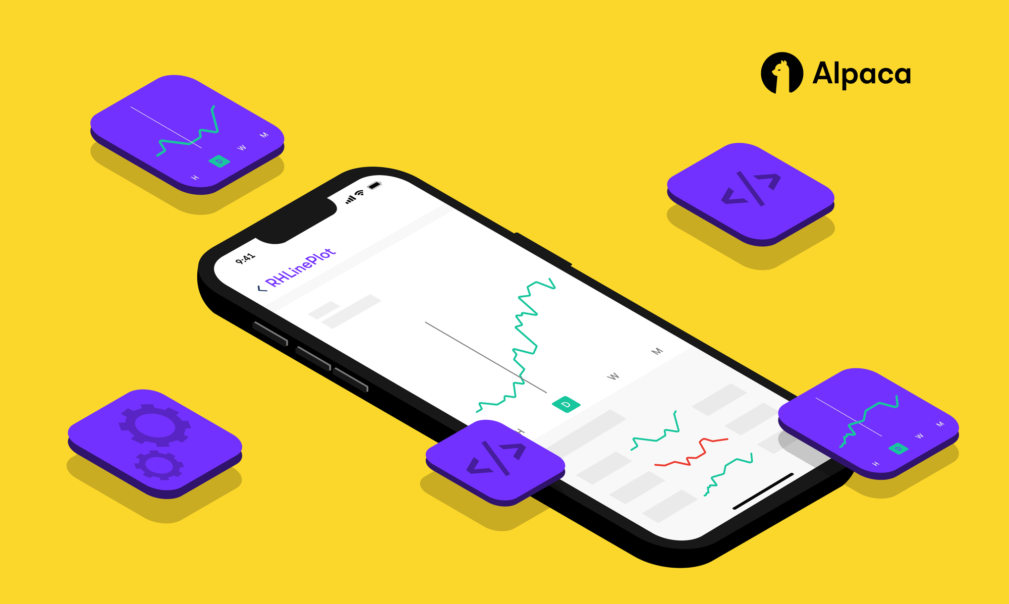
}The end result is a beautiful, interactive line plot that delivers an engaging experience.

How can I implement this into my own app?
- Clone or download the project from this GitHub repository
- Run the example app called RHLinePlot.xcworkspace to understand how the configuration works
- Import into your own project the RHLinePlot folder and any extra files you would like to take from the example folder, RHLinePlot/Examples/iOS/RHLinePlotExample
- Create an instance of the line plot where you need it and run your project
- Done!
Conclusion
Overall, we’ve shown how you can make API requests in Swift, how to utilize some of Alpaca’s endpoints, and how to handle data flow in a Swift project. If you’re interested in learning more about Swift and Alpaca, check out this article on open-sourcing a commission-free trading app with our Broker API!
Now you should be armed with the ability to interface Publishers with the Alpaca Market Data API and be ready to make a strong impression on your users! Hopefully, this integration can help take your user engagement to the next level and set you on the path to reaching greater heights.
References
[1] “Robinhood reports third quarter 2021 results,” Robinhood. [Online]. Available: https://investors.robinhood.com/news/news-details/2021/Robinhood-Reports-Third-Quarter-2021-Results/default.aspx. [Accessed: 23-Dec-2021].
[2] A. Kucheriavy, “Council post: Good UX is good business: How to reap its benefits,” Forbes, 11-Oct-2017. [Online]. Available: https://www.forbes.com/sites/forbestechcouncil/2015/11/19/good-ux-is-good-business-how-to-reap-its-benefits/?sh=690cfed34e51. [Accessed: 29-Dec-2021].
Please note that this article is for educational and informational purposes only. All screenshots are for illustrative purposes only. All investments involve risk and the past performance of a security, or financial product does not guarantee future results or returns.There is always the potential of losing money when you invest in securities, or other financial products. Investors should consider their investment objectives and risks carefully before investing. Alpaca does not recommend any specific securities or investment strategies.
Alpaca does not prepare, edit, or endorse Third Party Content. Alpaca does not guarantee the accuracy, timeliness, completeness or usefulness of Third Party Content, and is not responsible or liable for any content, advertising, products, or other materials on or available from third party sites.
Brokerage services are provided by Alpaca Securities LLC ("Alpaca"), member FINRA/SIPC, a wholly-owned subsidiary of AlpacaDB, Inc. Technology and services are offered by AlpacaDB, Inc.
This is not an offer, solicitation of an offer, or advice to buy or sell securities, or open a brokerage account in any jurisdiction where Alpaca is not registered (Alpaca is registered only in the United States).